


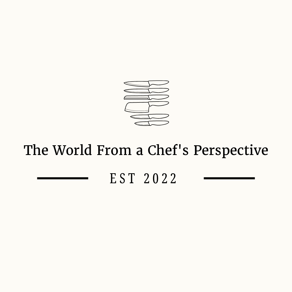
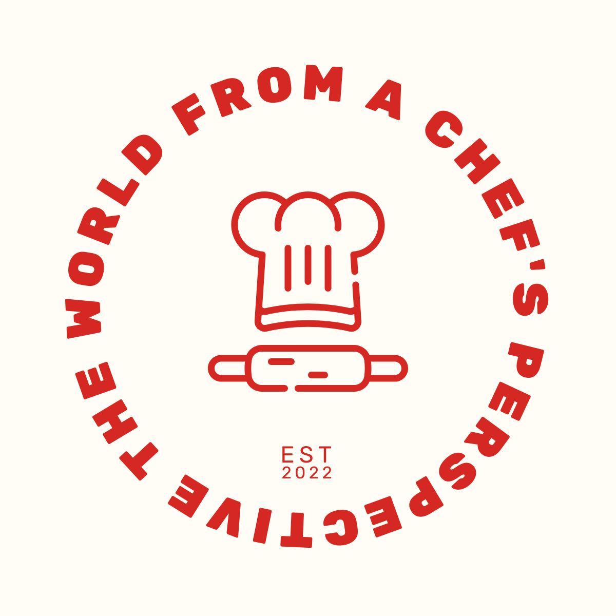
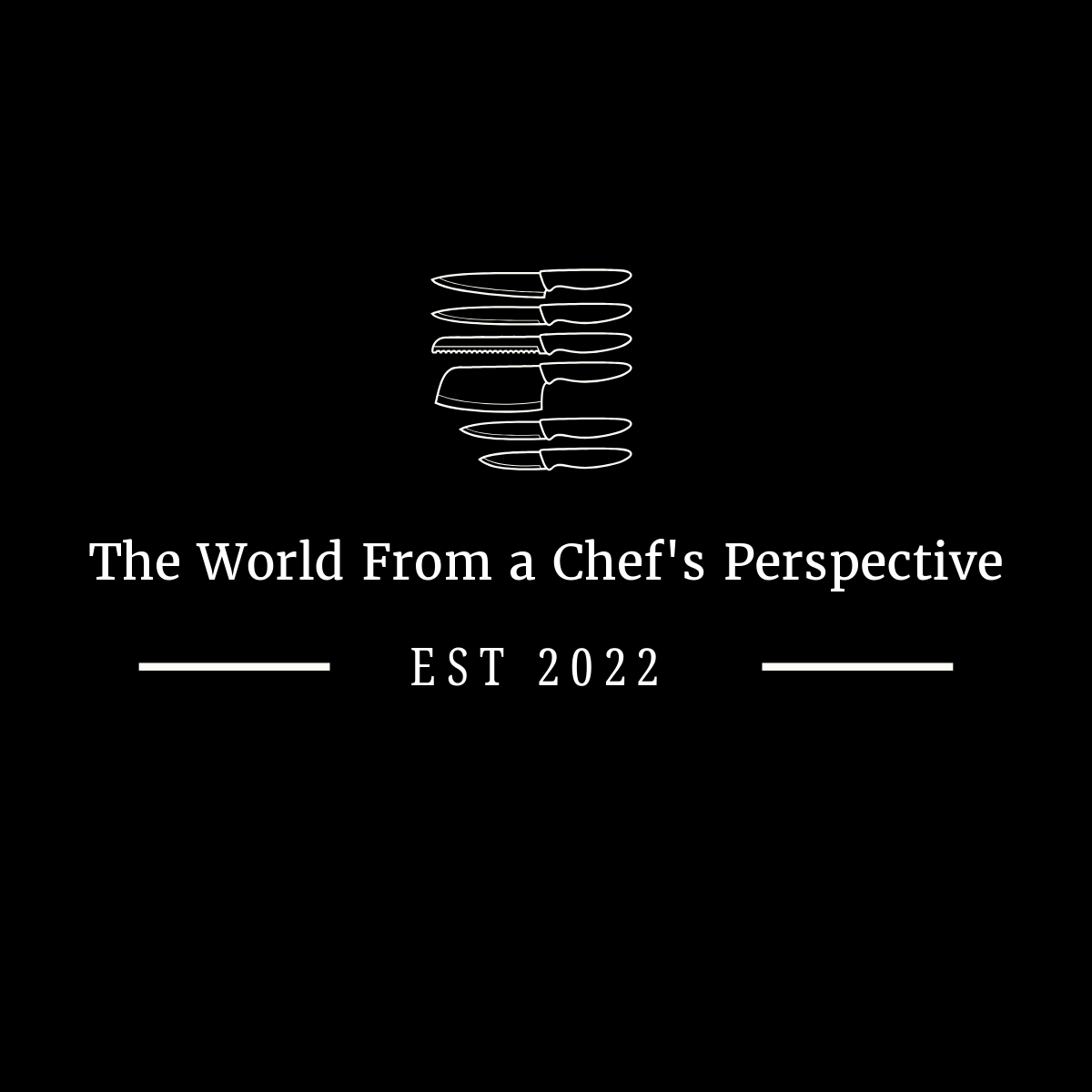
Reader Poll!
I need your help deciding on a new logo.

The World From a Chef’s Perspective Needs to level up with a new logo. Which one is your favorite?
Look at these sample logos designed by AmorDesigns and let me know what you like by voting in the poll below!


Thank you for being a loyal subscriber. I appreciate every one of you!
I chose #3. For me, it has the feel of a positive, full perspective for your blog.
i voted for 2, but 4 has 2x the votes... but the color scheme is just inverted, right? I think you could get away with using both under the right circumstances.